作者: afenxi来源: afenxi时间:2017-07-05 12:47:55
Python 的科学栈相当成熟,各种应用场景都有相关的模块,包括机器学习和数据分析。数据可视化是发现数据和展示结果的重要一环,只不过过去以来,相对于 R 这样的工具,发展还是落后一些。
幸运的是,过去几年出现了很多新的Python数据可视化库,弥补了一些这方面的差距。matplotlib 已经成为事实上的数据可视化方面最主要的库,此外还有很多其他库,例如vispy,bokeh, seaborn, pyga, folium 和 networkx,这些库有些是构建在 matplotlib 之上,还有些有其他一些功能。
本文会基于一份真实的数据,使用这些库来对数据进行可视化。通过这些对比,我们期望了解每个库所适用的范围,以及如何更好的利用整个 Python 的数据可视化的生态系统。
我们在 Dataquest 建了一个交互课程,教你如何使用 Python 的数据可视化工具。如果你打算深入学习,可以点这里。
探索数据集
在我们探讨数据的可视化之前,让我们先来快速的浏览一下我们将要处理的数据集。我们将要使用的数据来自 openflights。我们将要使用航线数据集、机场数据集、航空公司数据集。其中,路径数据的每一行对应的是两个机场之间的飞行路径;机场数据的每一行对应的是世界上的某一个机场,并且给出了相关信息;航空公司的数据的每一行给出的是每一个航空公司。
首先我们先读取数据:
1 2 3 4 5 6 7 8 9 10 11 # Import the pandas library. import pandas # Read in the airports data. airports = pandas.read_csv("airports.csv", header=None, dtype=str) airports.columns = ["id", "name", "city", "country", "code", "icao", "latitude", "longitude", "altitude", "offset", "dst", "timezone"] # Read in the airlines data. airlines = pandas.read_csv("airlines.csv", header=None, dtype=str) airlines.columns = ["id", "name", "alias", "iata", "icao", "callsign", "country", "active"] # Read in the routes data. routes = pandas.read_csv("routes.csv", header=None, dtype=str) routes.columns = ["airline", "airline_id", "source", "source_id", "dest", "dest_id", "codeshare", "stops", "equipment"]
这些数据没有列的首选项,因此我们通过赋值 column 属性来添加列的首选项。我们想要将每一列作为字符串进行读取,因为这样做可以简化后续以行 id 为匹配,对不同的数据框架进行比较的步骤。我们在读取数据时设置了 dtype 属性值达到这一目的。
我们可以快速浏览一下每一个数据集的数据框架。
1 airports.head() 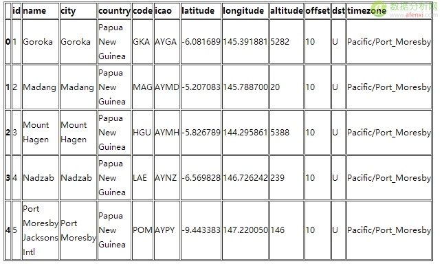
Python 1 airlines.head() 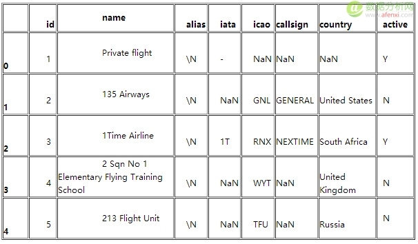
Python 1 routes.head() 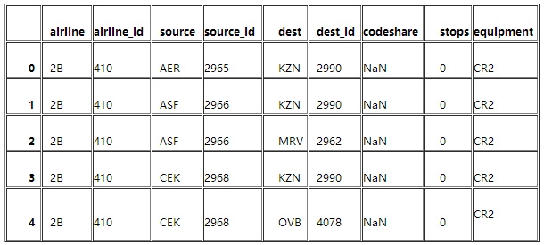
我们可以分别对每一个单独的数据集做许多不同有趣的探索,但是只要将它们结合起来分析才能取得最大的收获。Pandas 将会帮助我们分析数据,因为它能够有效的过滤权值或者通过它来应用一些函数。我们将会深入几个有趣的权值因子,比如分析航空公司和航线。
那么在此之前我们需要做一些数据清洗的工作。
1 routes = routes[routes["airline_id"] != "N"]
这一行命令就确保了我们在 airline_id 这一列只含有数值型数据。
制作柱状图
现在我们理解了数据的结构,我们可以进一步地开始描点来继续探索这个问题。首先,我们将要使用 matplotlib 这个工具,matplotlib 是一个相对底层的 Python 栈中的描点库,所以它比其他的工具库要多敲一些命令来做出一个好看的曲线。另外一方面,你可以使用 matplotlib 几乎做出任何的曲线,这是因为它十分的灵活,而灵活的代价就是非常难于使用。
我们首先通过做出一个柱状图来显示不同的航空公司的航线长度分布。一个柱状图将所有的航线的长度分割到不同的值域,然后对落入到不同的值域范围内的航线进行计数。从中我们可以知道哪些航空公司的航线长,哪些航空公司的航线短。
为了达到这一点,我们需要首先计算一下航线的长度,第一步就要使用距离公式,我们将会使用余弦半正矢距离公式来计算经纬度刻画的两个点之间的距离。
1 2 3 4 5 6 7 8 9 10 11 12 13 import math def haversine(lon1, lat1, lon2, lat2): # Convert coordinates to floats. lon1, lat1, lon2, lat2 = [float(lon1), float(lat1), float(lon2), float(lat2)] # Convert to radians from degrees. lon1, lat1, lon2, lat2 = map(math.radians, [lon1, lat1, lon2, lat2]) # Compute distance. dlon = lon2 - lon1 dlat = lat2 - lat1 a = math.sin(dlat/2)**2 + math.cos(lat1) * math.cos(lat2) * math.sin(dlon/2)**2 c = 2 * math.asin(math.sqrt(a)) km = 6367 * c return km
然后我们就可以使用一个函数来计算起点机场和终点机场之间的单程距离。我们需要从路线数据框架得到机场数据框架所对应的 source_id 和 dest_id,然后与机场的数据集的 id 列相匹配,然后就只要计算就行了,这个函数是这样的:
1 2 3 4 5 6 7 8 9 10 11 def calc_dist(row): dist = 0 try: # Match source and destination to get coordinates. source = airports[airports["id"] == row["source_id"]].iloc[0] dest = airports[airports["id"] == row["dest_id"]].iloc[0] # Use coordinates to compute distance. dist = haversine(dest["longitude"], dest["latitude"], source["longitude"], source["latitude"]) except (ValueError, IndexError): pass return dist
如果 source_id 和 dest_id 列没有有效值的话,那么这个函数会报错。因此我们需要增加 try/catch 模块对这种无效的情况进行捕捉。
最后,我们将要使用 pandas 来将距离计算的函数运用到 routes 数据框架。这将会使我们得到包含所有的航线线长度的 pandas 序列,其中航线线的长度都是以公里做单位。
1 route_lengths = routes.apply(calc_dist, axis=1)
现在我们就有了航线距离的序列了,我们将会创建一个柱状图,它将会将数据归类到对应的范围之内,然后计数分别有多少的航线落入到不同的每个范围:
1 2 3 4 5 import matplotlib.pyplot as plt %matplotlib inline plt.hist(route_lengths, bins=20) 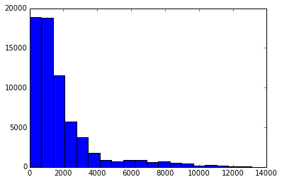
我们用 import matplotlib.pyplot as plt 导入 matplotlib 描点函数。然后我们就使用 %matplotlib inline 来设置 matplotlib 在 ipython 的 notebook 中描点,最终我们就利用 plt.hist(route_lengths, bins=20) 得到了一个柱状图。正如我们看到的,航空公司倾向于运行近距离的短程航线,而不是远距离的远程航线。
使用 seaborn
我们可以利用 seaborn 来做类似的描点,seaborn 是一个 Python 的高级库。Seaborn 建立在 matplotlib 的基础之上,做一些类型的描点,这些工作常常与简单的统计工作有关。我们可以基于一个核心的概率密度的期望,使用 distplot 函数来描绘一个柱状图。一个核心的密度期望是一个曲线 —— 本质上是一个比柱状图平滑一点的,更容易看出其中的规律的曲线。
1 2 import seaborn seaborn.distplot(route_lengths, bins=20) 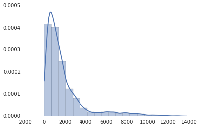
正如你所看到的那样,seaborn 同时有着更加好看的默认风格。seaborn 不含有与每个 matplotlib 的版本相对应的版本,但是它的确是一个很好的快速描点工具,而且相比于 matplotlib 的默认图表可以更好的帮助我们理解数据背后的含义。如果你想更深入的做一些统计方面的工作的话,seaborn 也不失为一个很好的库。
条形图
柱状图也虽然很好,但是有时候我们会需要航空公司的平均路线长度。这时候我们可以使用条形图--每条航线都会有一个单独的状态条,显示航空公司航线的平均长度。从中我们可以看出哪家是国内航空公司哪家是国际航空公司。我们可以使用pandas,一个python的数据分析库,来酸楚每个航空公司的平均航线长度。
1 2 3 4 5 6 7 import numpy # Put relevant columns into a dataframe. route_length_df = pandas.DataFrame(".format(source, dest) # If the key is already in weights, increment the weight. if key in weights: weights[key] += 1 # If the key is in added keys, initialize the key in the weights dictionary, with a weight of 2. elif key in added_keys: weights[key] = 2 # If the key isnt in added_keys yet, append it. # This ensures that we arent adding edges with a weight of 1. else: added_keys.append(key)
一旦上面的代码运行,这个权重字典就包含了每两个机场之间权重大于或等于 2 的连线。所以任何机场有两个或者更多连接的路由将会显示出来。
Python 1 2 3 4 5 6 7 8 9 10 11 12 13 14 15 16 17 18 19 20 21 22 23 24 25 26 27 28 29 30 31 32 # Import networkx and initialize the graph. import networkx as nx graph = nx.Graph() # Keep track of added nodes in this set so we dont add twice. nodes = set() # Iterate through each edge. for k, weight in weights.items(): try: # Split the source and dest ids and convert to integers. source, dest = k.split("_") source, dest = [int(source), int(dest)] # Add the source if it isnt in the nodes. if source not in nodes: graph.add_node(source) # Add the dest if it isnt in the nodes. if dest not in nodes: graph.add_node(dest) # Add both source and dest to the nodes set. # Sets dont allow duplicates. nodes.add(source) nodes.add(dest) # Add the edge to the graph. graph.add_edge(source, dest, weight=weight) except (ValueError, IndexError): pass pos=nx.spring_layout(graph) # Draw the nodes and edges. nx.draw_networkx_nodes(graph,pos, node_color=red, node_size=10, alpha=0.8) nx.draw_networkx_edges(graph,pos,width=1.0,alpha=1) # Show the plot. plt.show() 总结
有一个成长的数据可视化的 Python 库,它可能会制作任意一种可视化。大多数库基于 matplotlib 构建的并且确保一些用例更简单。如果你想更深入的学习怎样使用 matplotlib,seaborn 和其他工具来可视化数据,在这儿检出其他课程。
原文出处: Vik Paruchuri 译文出处:开源中国
原创文章,作者:古思特,如若转载,请注明出处:《Python教程:7款数据图表工具的比较》http://www.afenxi.com/post/9985